New Life or a No-Go?
New Life or A No-Go
Old, tired homes are out there, but what constitutes whether it’s worth it to put in the work to revitalize one? That’s a great question, and there are a lot of different answers, depending on time, budget, and access to skilled labour.
First, if you are a contractor, and can do the work yourself, then that saves you a tonne of money. That being said, do you have the time? Oftentimes handi-men think that they can do all of the work themselves, but after a month of working full-time at their day job, then coming to the flip property until the wee hours of the morning, things can start feeling a bit daunting.
What repairs need to be done before the refreshing bit can be started? Older homes have potentially a tonne of problems that can go along with them. If the owners neglected small things, like a slow leaking tap, these can often translate into big, expensive problems that take a lot of time and/or money to fix. A home inspection is a must.
Consider how best to use the square footage of the home. In this flip we opened up the dining room, removed the wall between dining and kitchen, and thus created an “eat in” kitchen space. This is much more tailored to how people live these days, whereas the formal dining room catered to days gone by.
Check out these before and after shots, and see how we utilized the spaces to accommodate a young family, or someone looking for an investment rental. This was almost ten years ago, so some of the finishes/fixtures might look a bit dated (you really see it in the light fixtures), but the transformation was still amazing.
Rec-Room:
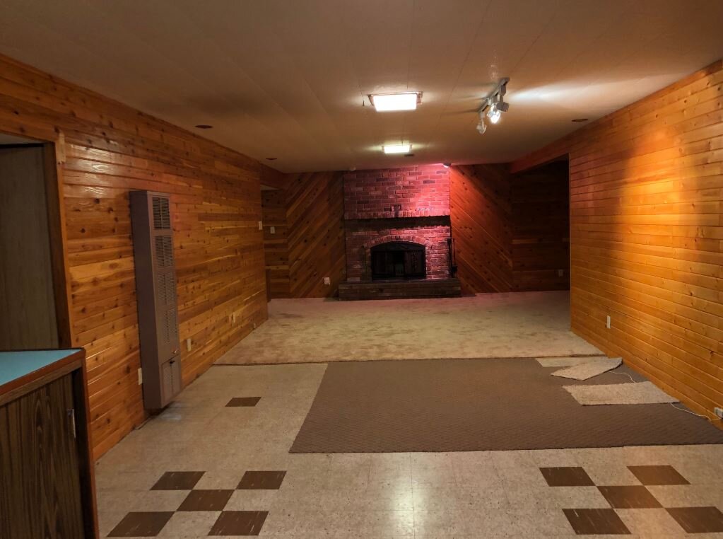
This room was old… and brown on brown on brown. Ugh. By simply changing out the flooring, drywalling the walls, and painting the space it suddenly became bright and fresh.
This is the dated rec-room, before we got in there. The old flooring was left in place, as we suspected asbestos, and were planning on carpeting anyways (read my IG post about asbestos, to see how it is safe to let it be). One thing we loved was the old, brick fireplace.
Adding the pot lights really helped brighten up this traditional basement space, as there were no windows once the bedrooms were added.
Kitchen:
The awkward peninsula was removed, to create better flow in this space, as well as we installed a wall of lower cabinetry. We widened the door into the formal dining room, making it a more open-concept floor plan, and brought in brighter finishes all round.
Wow, those countertops are something!
The dark cabinets were pretty icky, too.
By brightening up the cabinets, and removing the valance above the window, the kitchen became a bright, inviting space. If the budget was unlimited we would have moved the window, but that would have added an expense that the sale of the property couldn’t recoup.
The venting for the hood fan wasn’t complete in these photos, but it got finished later, as did the floor register in front of the sink. Due to the estimated return on the property, given location, the option of taking the cabinetry to the ceiling didn’t pencil out, so we just did standard cabinetry with open space above.
The pre-existing opening into the dining area was a standard door width, as there was a cabinet in the corner. We removed that cabinet, and used uppers in a buffet style application, which aren’t as deep as lowers. This allowed us to open up the dining room entrance, and gave a brighter feel to both spaces, as the sight lines as well as the light transfer was improved.
Bathroom:
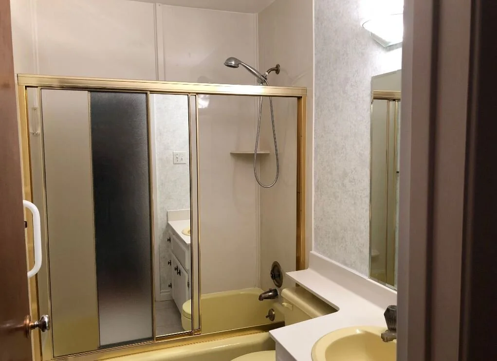
The original main bathroom was done in classic Harvest Gold, typical to the time period of the home. We went in and gutted it, but by keeping the layout, and thus the plumbing in the same spots, it saved money in our budget.
Who grew up with Harvest Gold fixtures? Or maybe you had Avocado Green???
What an improvement! Even just by removing the banjo arm countertop the bathroom seems bigger.
Living/Dining Room:
The best thing about this space was the amount of natural light. We had hoped to keep a couple of the original features, but after much debate felt that by having more open space it suited the rooms much better.
I was so sad to see the small hall built-in go (not so much the dining room built in), but in the end it was best for the overall flow of the space and the newer, contemporary look that the contractor was going for.
We did keep the ceiling though, and that kept a bit of the home’s character.
New flooring throughout gave the space a more cohesive look. You can’t tell from the before photos but the floors were in pretty rough shape, and repairing them would have blown the budget.
The staging gave the space a great look for the listing.
Overall:
Due to the investment of hiring a designer, and a staging company, the house sold within a month (which was a short sale at the time).


