What You See Isn't Always What You Get
A beautiful view, but all you see is the wood, and the colour brown in the space. I’l love to see more colour, maybe even blue to match the sky, in the home decor.
Ok, so are you a realtor, or are you trying to sell your home? In the past I have done a blog post about staging (Oct. 21, 2019), but this listing came up and I just had to put some comments down on paper. When I took a look at the listing it became apparent that it was a prime example of a property that only appeals to a very small percentage of potential buyers. Part of that is due to the fact that it is a large, lifestyle specific type of property, but another part of it is that it is decorated in a very specific way. Neither of these two facts help a property to sell quickly. I thought that by using the pictures of this property it would be a great example, showing you how I would go about making changes in order to stage the property for it to have broader appeal to potential buyers. Or, if you have bought a property that is very style-specific yourself, and it’s not really your style, you can see how things can be changed up.
Although it’s a beautiful property, one of the first things that I noticed when scrolling through all of the pictures is how brown everything is. Brown on brown on brown. Ugh. One of the things that I would recommend to the potential buyer and/or to the seller and listing agent is to inject pieces into the photos that have more color. This can be done by major changes like painting, or using lighter furniture, but can also be done on a smaller scale, like buying or using accessories and art that are more colourful.
It’s the brightest space in the house, based on the photos.
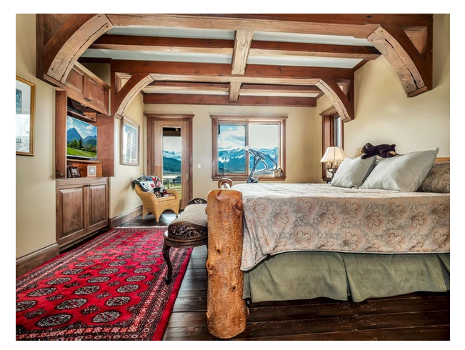
This is the master bedroom. It is actually one of the brighter spaces in the home, so that’s a plus. If I were staging this house the first thing I would do is remove the red rug and the exercise equipment. That doesn’t mean that the elliptical needs to be sold or put where it can’t be accessed, it just means that it needs to be placed in a more gym-appropriate style of space in the home, not in the master bedroom, which is supposed to denote calm and rest. The bedding could be bumped up as well. The bed should look like it is a place that you want to leap onto and get lost in it’s plush, soft, embrace. Lots of toss cushions, a throw, and a properly fitting skirt, or none at all, will make the bed look and feel more luxurious. I would use white bedding, again to brighten up the space, possibly with some brightly coloured accent pillows. Remember that anything that you buy to stage your home now comes with you, so it’s money that you will get to benefit from in your new space.
I’d love to have a tub that looked out to my yard. This is a beautiful fixture.
The ensuite is lovely, although it looks a bit weird with the fish-eye photo (I’m not a fan, but I understand that it creates a “look” that realtors are going for). A number of things could be done to make this space more appealing in this photo. I would remove all of the rugs on the floor, as they are very distracting. The nick-nacks on the window ledge are distracting also. I would lean towards placing one long white tray, along the ledge, with a set of three matching containers, like you would see at a hotel. When staging bathrooms I always recommend using white towels. They again give a sense of hotel-chic, regardless of the architectural style of the home. Lastly, having the closet door open I understand, to show the flow of the ensuite into the master closet. What I don’t understand is showing a messy closet. Even if half of the items are packed away for the photos, and for the duration of the sale, it makes the property seem like it has an abundance of storage space, and looks neat and clean.
This colour may not appeal to everyone.
The kitchen….sigh. Although the walls are a lighter colour, the mustard is very home-owner specific. It is a colour, like pink let’s say, that very few people will be attracted to. So, if they aren’t planning on painting out the mustard colour, there are a couple of things that I would do to brighten up the space. Depending on budget, I would definitely change out the hardware on the cabinets. Cabinet hardware is the jewellery of a space. These pulls and knobs are getting lost on the wood, since they are also brown. Then I would find white or chrome items to use as accessories in the open shelf, on the island, and above the cabinetry. This will create more reflective surfaces that will make the space feel brighter.
All that you see from this angle is wood on wood. It is very hard to see the grandeur of the space, as visually is isn’t very appealing.
The clutter in this image needs to be removed, as does the patterned rug in the back hallway. Both are very distracting, and you want the viewer to see the room, not the clutter. I would also clear out 50% of the glassware in the glass front cabinet, as it again looks cluttered. (Am I sounding like a broken record, yet? LOL).
Nothing can beat that view, and sunshine is spectacular.
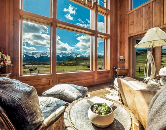
This space is beautiful, but still plays very dark, with the dark leather, the dark table, and the wood lamp. I would probably have placed the floral arrangement on the table, instead of the cactus, as all I see is dirt in the pot, since the plants are so small. Again, the hides on the floor and the alligator skin leather are all very taste-specific, and wouldn’t have to be in the space. I picture this room with a lighter butter, or white leather couch. Then I would pair it with a couple of matching brightly-patterned side chairs. It would make the world of difference to this space. Also I would use open, airy side tables, so that the wood flooring was visible, but broken up with the accessories and probably metallic/reflective finishes on the tables.
Nothing screams we aren’t ready for photos than leaving all of the personal items out, to be seen by all.
When staging a bathroom, whether it’s an ensuite or main, take away all of the personal items. Nobody cares that you use Head and Shoulders shampoo, so why have it out for people to see. Also, Kleenex boxes should be stored under the counter, for photos and showings, as no matter how pretty the box may be, it’s still just tissues. This photo also gives me a little chuckle, as it highlights all of the natural sunlight pouring into the bedroom, but you can see the camera...oops.
OMG, this is a lot of dead animals!
Ugh. I’m not making any ethical statements here, as I know lots of great people who are hunters, but come on!!!! This look/lifestyle appeals to so few people. Do you want to sell your house??? This look (all of the animal trophies) can even be seen as offensive to some. This doesn’t help with the task at hand, trying to sell the property. Store away any trophies, until you have a new home to move them to. Trust me, if you store them away for the sale of your home, you will be moving that much faster.
If you’re trying to sell your home, or in the market to buy a new house, I hope that these ideas can help you to see what’s not there, and not just be stuck with seeing what is there currently. I have many clients who have me help with staging, then say, “I wish I’d hired you when I moved in, as this makes so much more sense.” Everything has potential to change, and it is so much fun to make a house a home.
https://www.willowvalleyranch.ca/
Photos by IGuide


