To Flip, or Not to Flip…that is the question.
Old and tired becomes newly loved!
One of the kind of jobs that I love working on is house flips. Anyone that has watched HGTV knows that the flipping shows are a dime a dozen. They make it look all glamorous, apart from the one major problem that they all will undoubtedly encounter, and then within the time restraints of the show solve. Ha ha ha…
In reality house flips can go fairly smoothly, if the expectations going in are realistic. Timelines and budgets need to have contingencies in place, as surprises will always happen. Some small scale, some not so small scale.
When working on a flip, there are a few key things to consider:
Be sure to have a thorough, proper home inspection. This investment is money well spent, as it can help to preempt any costly surprises.
Do follow the trends. This is not what I always recommend in renovations, but for highest probability of resale, it really can help.
Do your research when sourcing out product. There are many ways to get a high-end look for less.
Have a good project manager in place. If you decide to take on this role yourself, be sure that you have the availability needed to keep things moving with the sub-trades, and choosing/ordering of materials.
Last, but not least, consider hiring a designer (hint hint) to go over your plans with. Often times a second set of eyes can prevent future mishaps from happening. This means keeping the potential for overspending to a minimum.
These are just a few tips, and it is a great type of building/design project. I love comparing a diamond in the rough, to the polished gem that someone eventually buys and lives in. Seeing people occupy a space that has gone through a flip-style transformation is so rewarding.
Call now, for your complimentary phone consultation.
403-818-3184
This is what the house looked like before the flip. There were a lot of older trees that needed to come down, and the house hadn’t been lived in for a number of years, post flood, thus it looked very neglected.
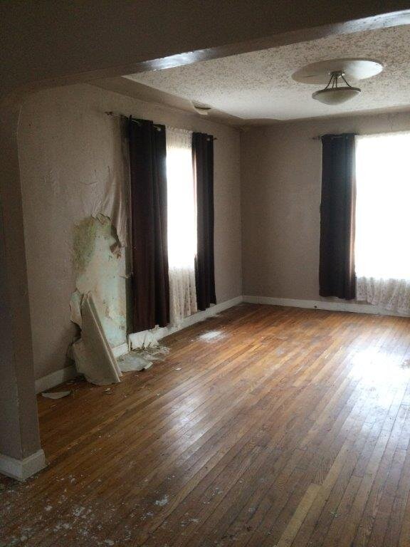
As is evident in this photo, the water damage, and moisture damage were extensive. It amazed me, though, that the hardwood floors were in such great shape still, and were able to be patched, repaired, and re-stained.
When picking the paint palette, we stuck with the historical colour series, from Benjamin Moore, that were time appropriate. The main floor colour is Chestertown Buff (HC-9). By having the contrasting flooring stain, and Cloud White (CC-40) trim colour, it looks authentic to the time the home was built.
The narrow opening to the kitchen made it seem extremely small. The square footage of the kitchen space wasn’t huge, but the way it was laid out only accentuated this fact.
Having a door to the opening of the kitchen just added to making the space seem cramped.
The contractor chose to use discontinued granite, thus getting a better price. The white cabinets help to make the space seem more spacious.
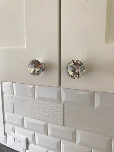
Since there weren’t a tonne of cabinet pulls we were able to go a bit pricier. This bit of bling, combined with the white backslash tiles created a bit of elegance to the small space.
The bathroom before was just gross…nothing else to say about it…lol.
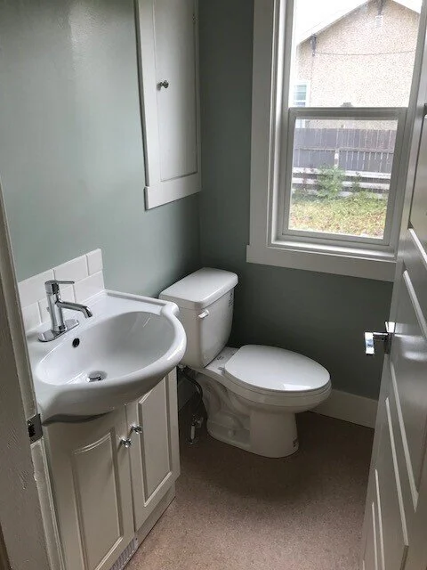
This is after construction. The small space warranted using the same tiny vanity (which was relatively new), and we kept the vintage medicine chest for added storage, and character.
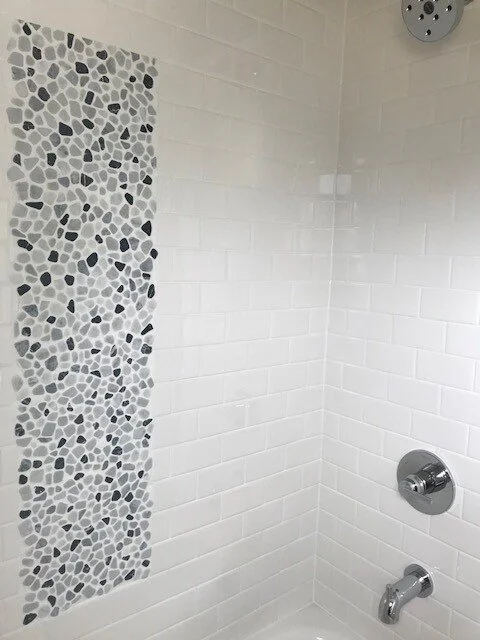
By adding a “picture” tile application, it created a bit of visual interest in the tub/shower combination.
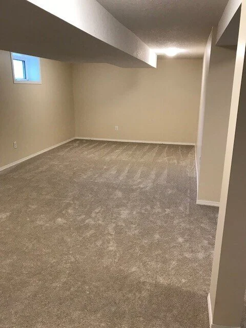
By developing the basement, and adding two bedrooms and a full bath, the house now had more usable living space, and therefore was much more marketable.


